Visualising Power Plant Data
This page explains the process involved in cleaning the provided power plant data set and display its visualisation. Please use the buttons below to switch between the two
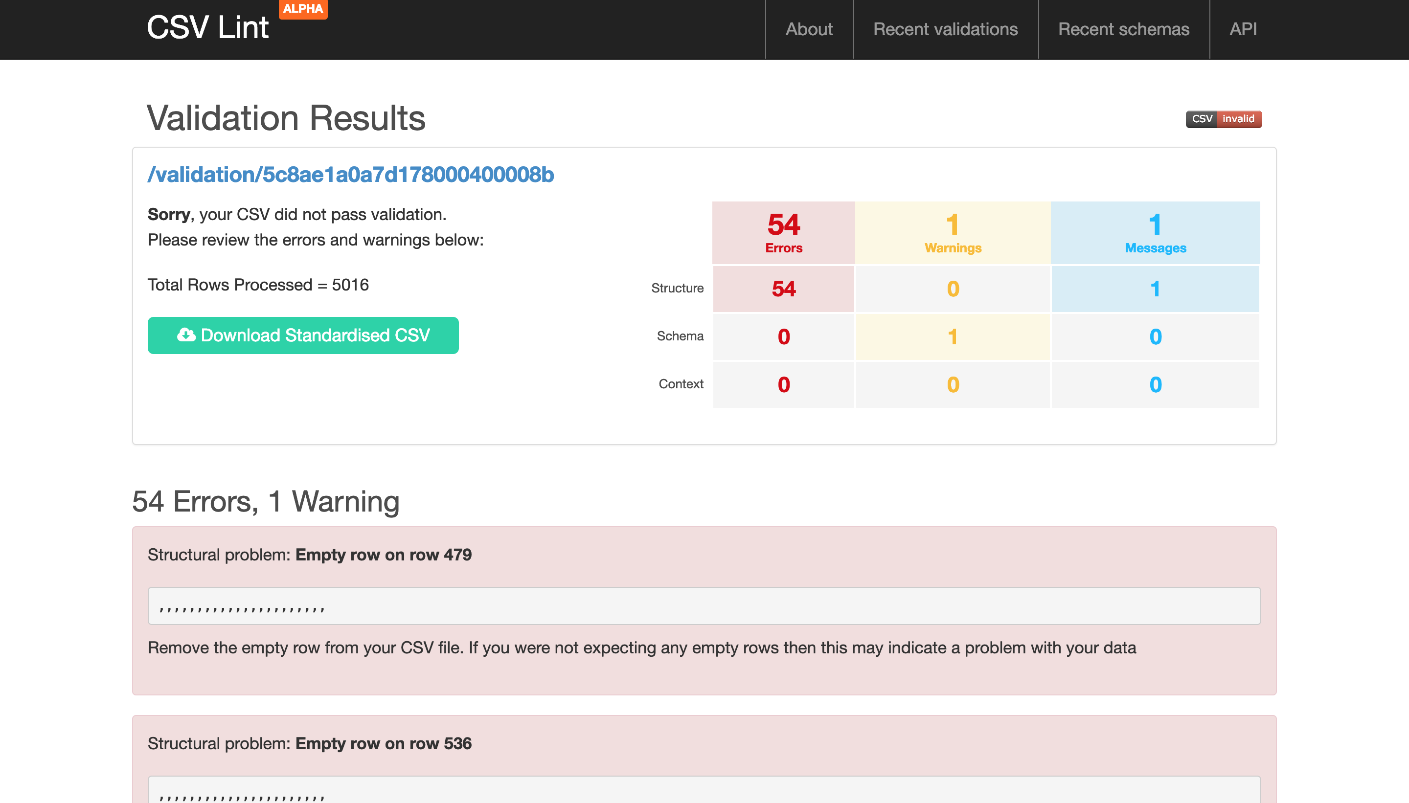
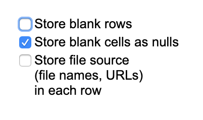
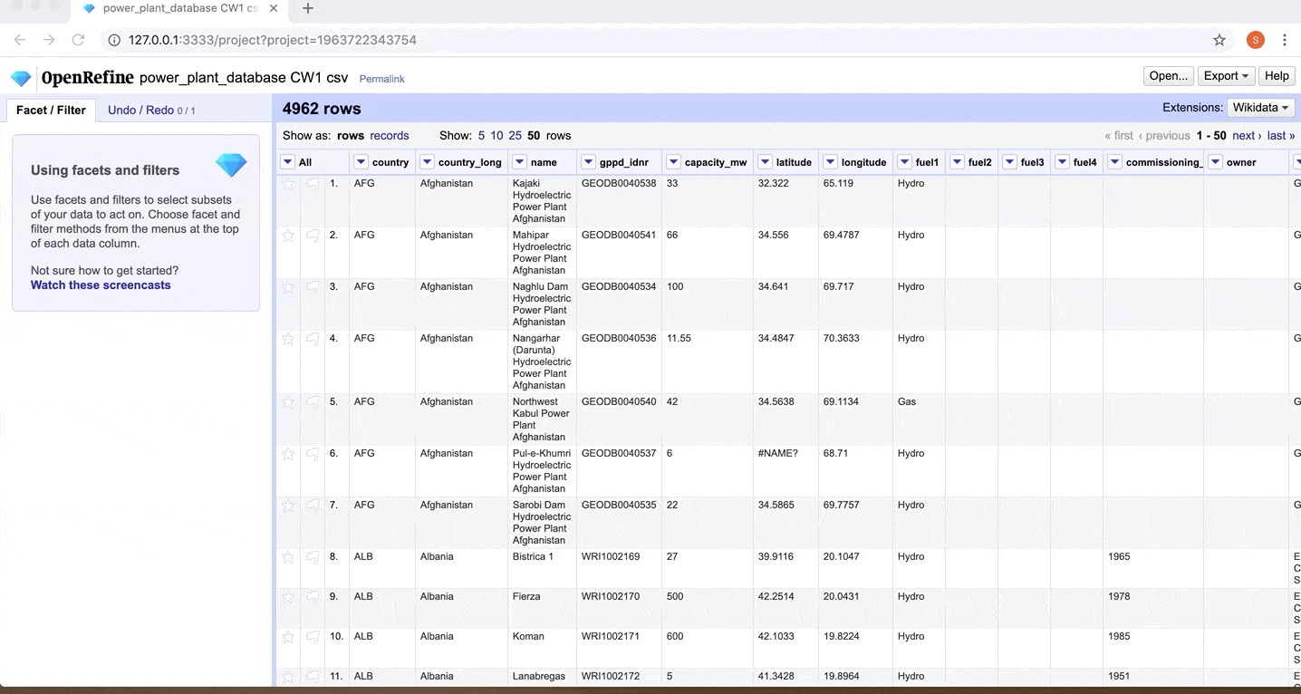
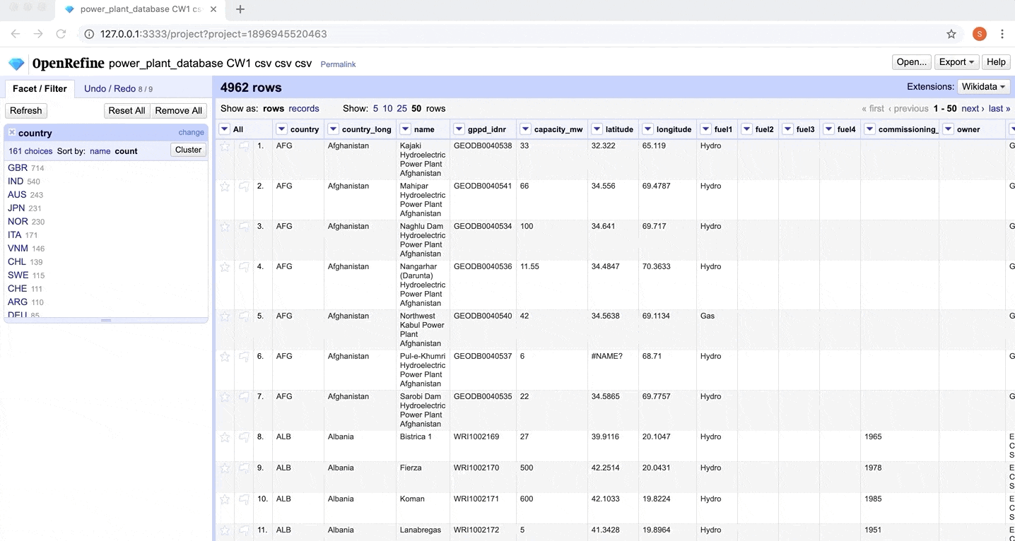
Error 1 - Blank Rows: The provided CSV file was checked using CSV Lint to spot the most common errors. The validation led to the discovery of 54 blank rows which were removed by unchecking the 'Store blank rows' option when creating a new project in Open Refine with the CSV.
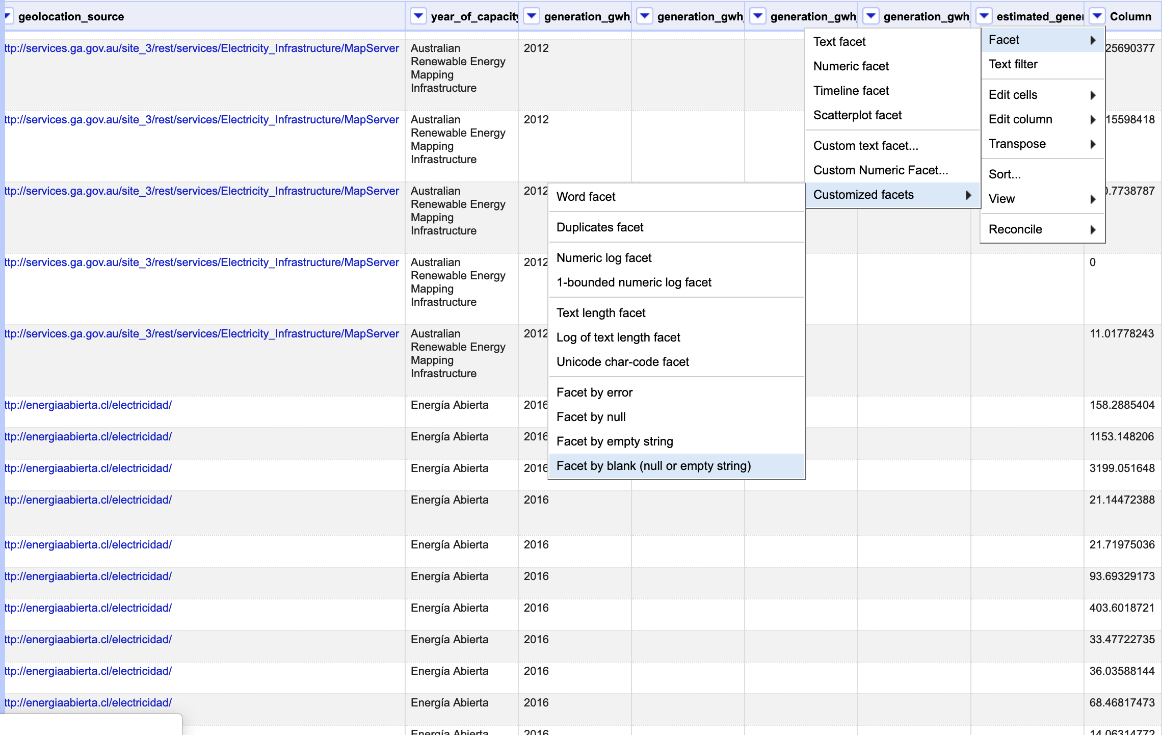
Error 2 - Shifted columns: Creating the project in Open Refine revealed an un-named column which was due to the fault of shifted column values throughout the data set. This was fixed by first filtering out the non-blank rows in the un-named column using the 'Facet by blank' option under 'Customized facets' and finally shifting the column values back to original using the GREL expression - 'cells[row.columnNames[2]].value' for the respective columns.
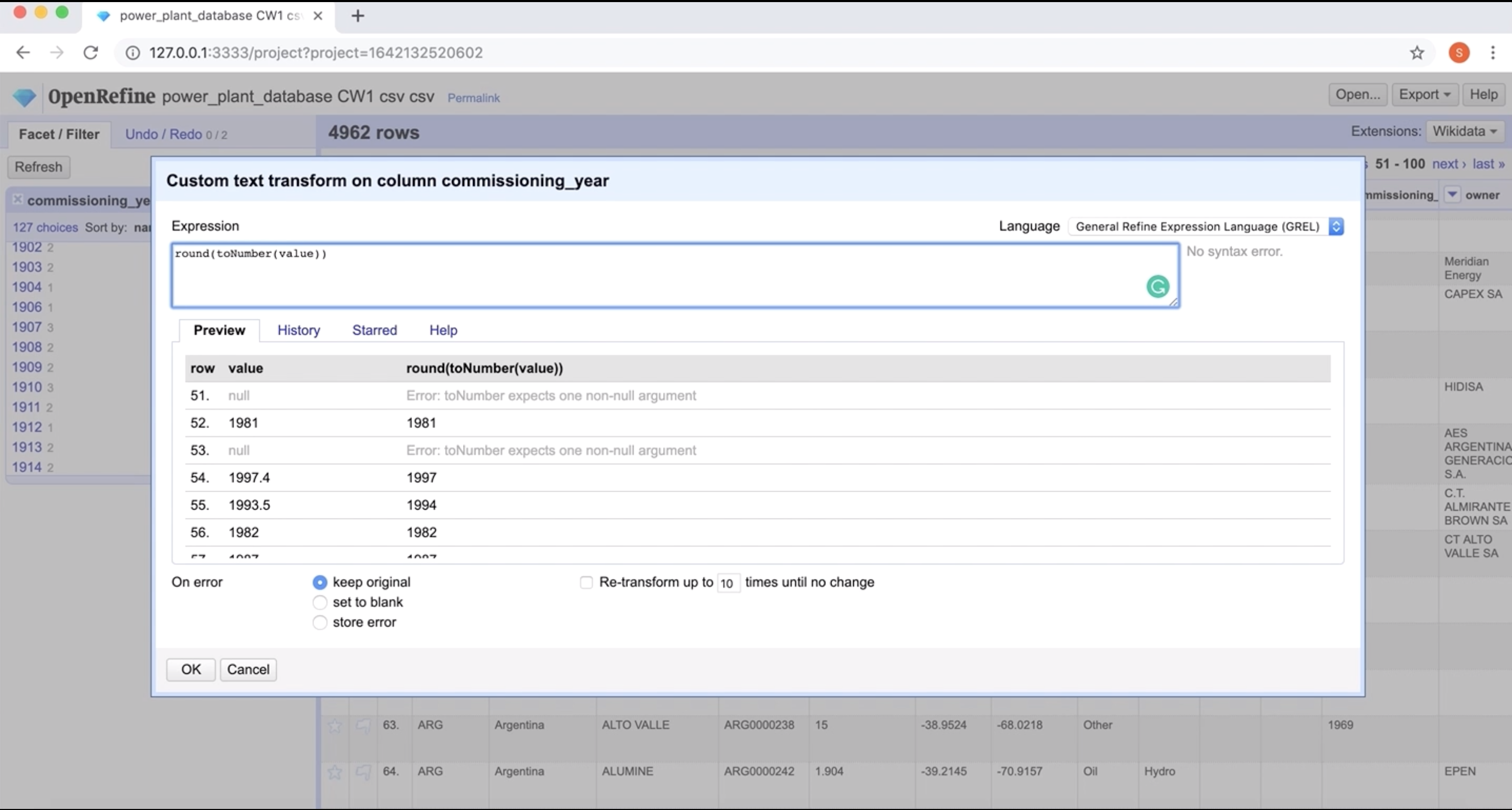
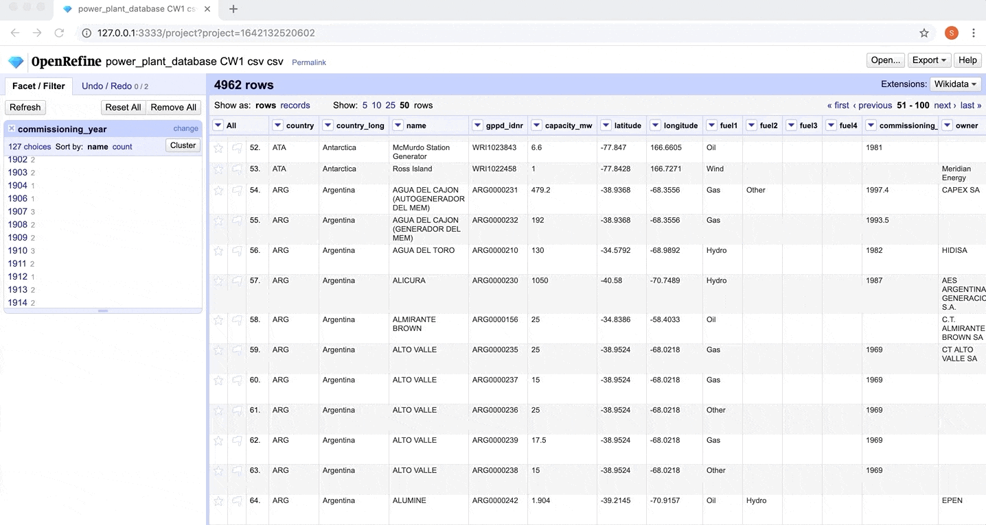
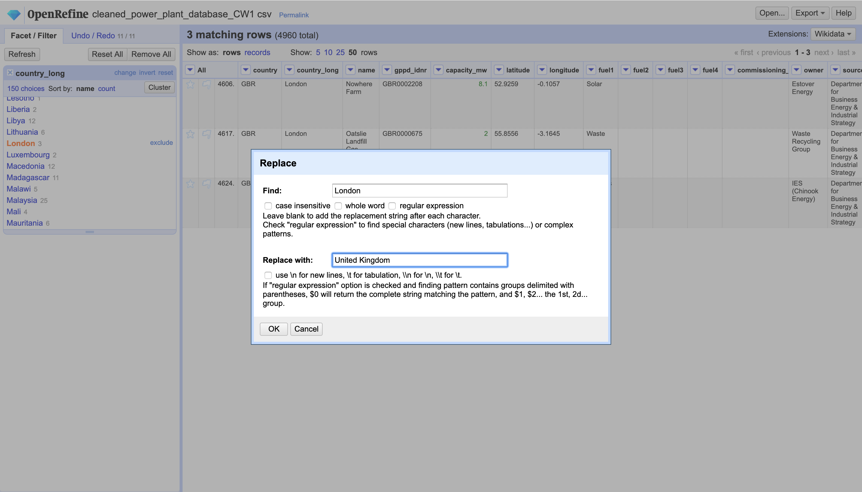
Error 3 - Factual Errors: For instance, the commissioning_year column of the dataset included some years with decimal points such as 2002.5 on row 86. These were fixed using the Open Refine transform feature on the column values by rounding of the years using the GREL - round(toNumber(value)). Another instance is of 'London' being a value in the country_long column which was correctly replaced with United Kingdom.
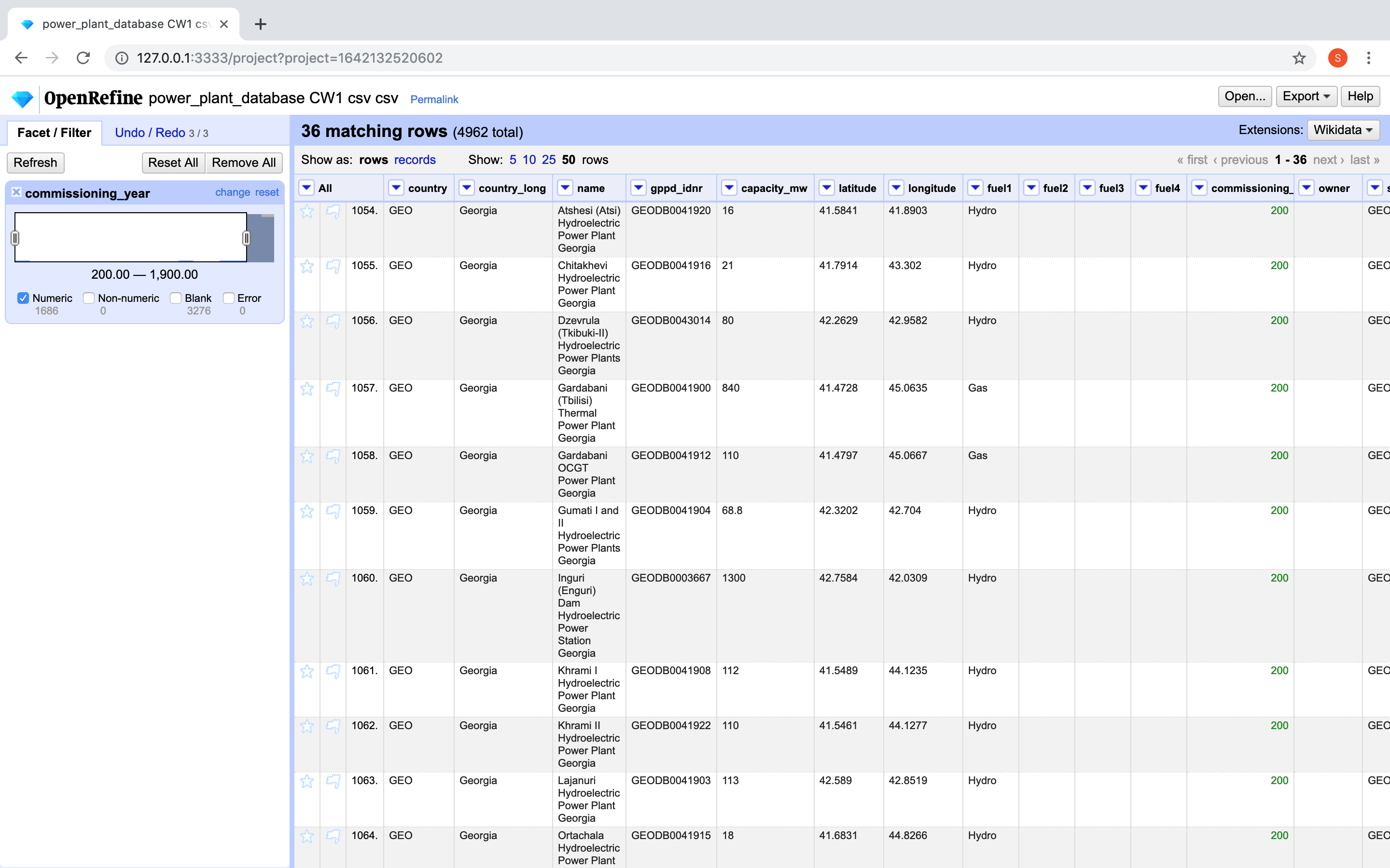
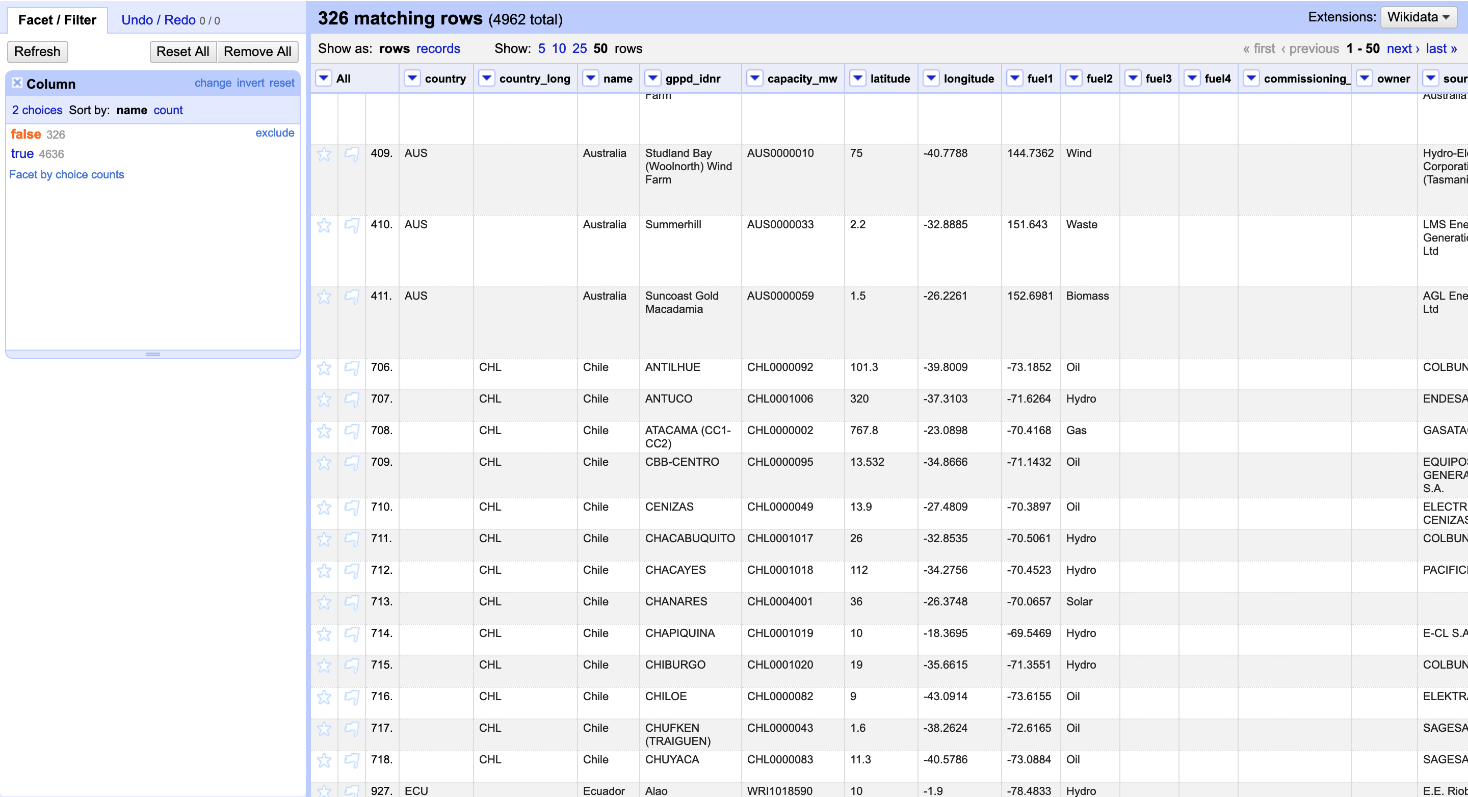
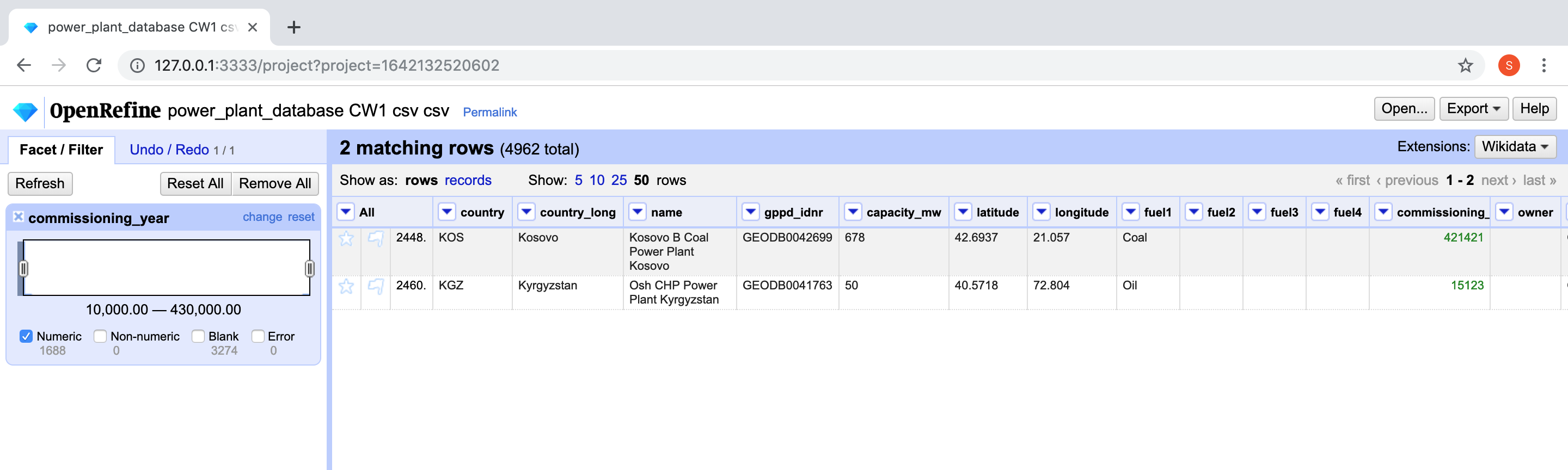
Error 4 - Outlier Values: Using Open Refine's Numeric and Text Length Facet on commissioning_year and country columns respectively enabled me to filter out and remove incorrect and outlier values for instance 'Chile' instead of 'CHL' in the country column and years '421421' and '200' in the commissioning_year column.
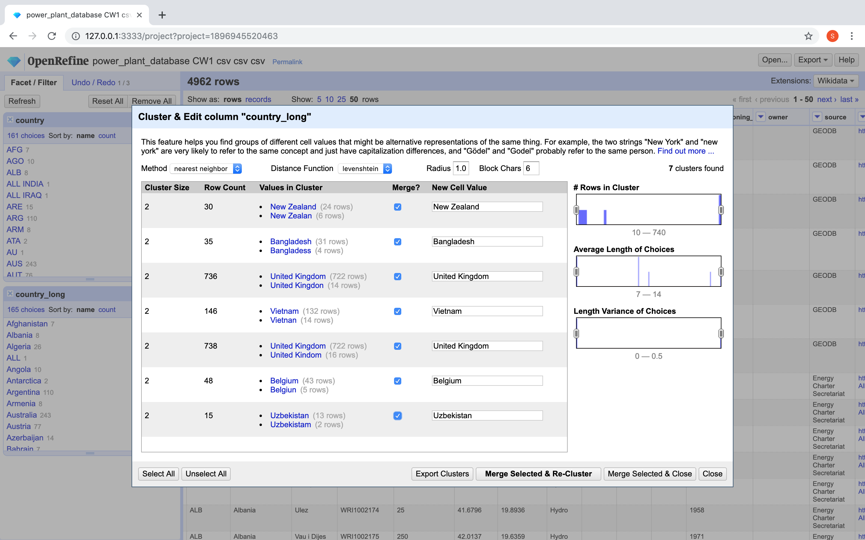
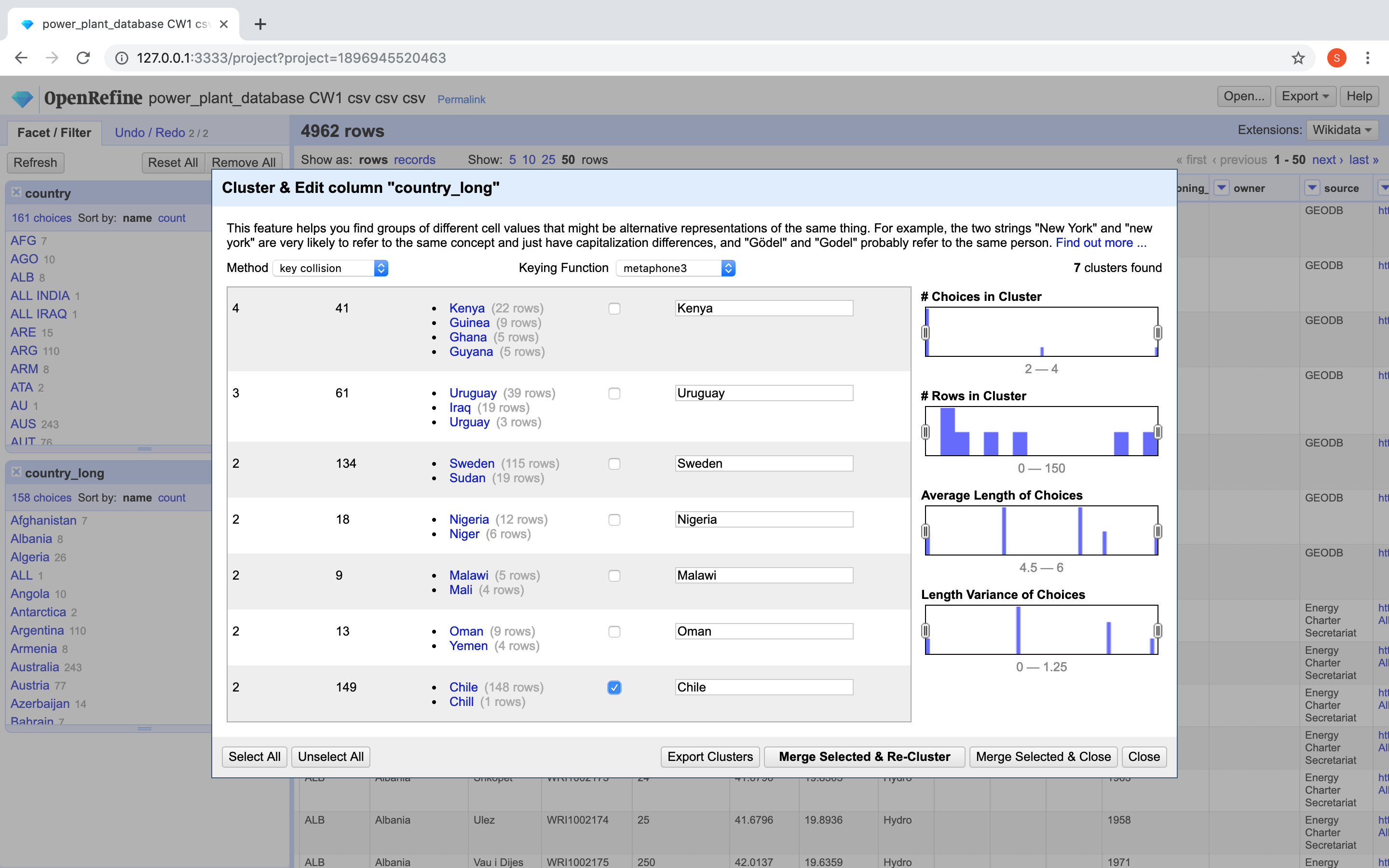
Error 5 - Clustering Similar Values: There were many spelling errors in the country_long column for example 'Bangladess' and 'United Kingdon'. These were fixed using Open Refine's cluster feature after creating the text facet on the country_long column. Different clustering techniques were tried and the ones giving the best results (for instance nearest neighbour clustering for the mentioned examples) were selected to merge the clusters.
Error 6 - Other Miscellaneous Errors: Various other errors were found and fixed in the CSV including:
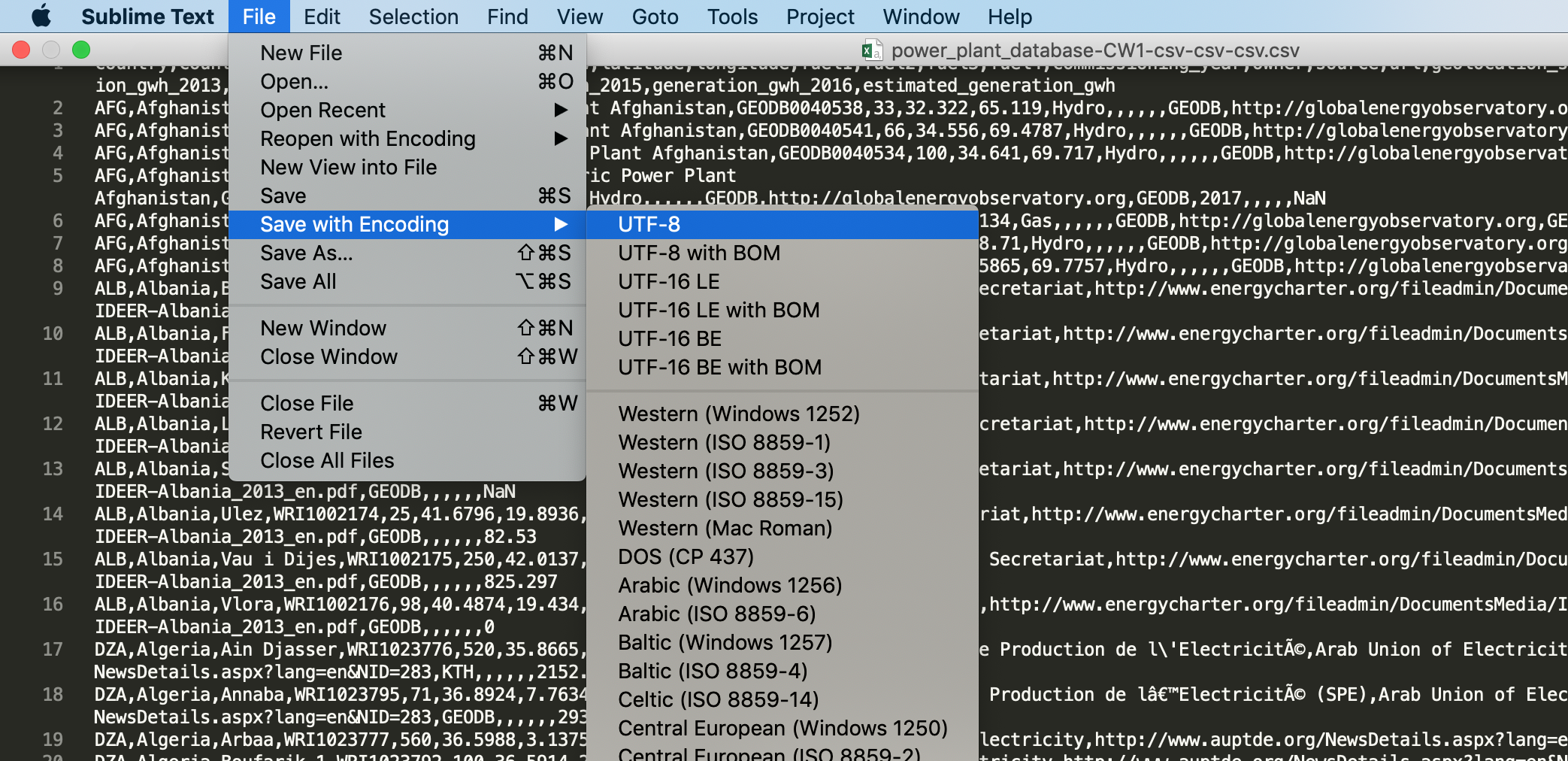
- Fixing the encoding errors in the file by saving it with UTF-8 encoding using Sublime text editor.
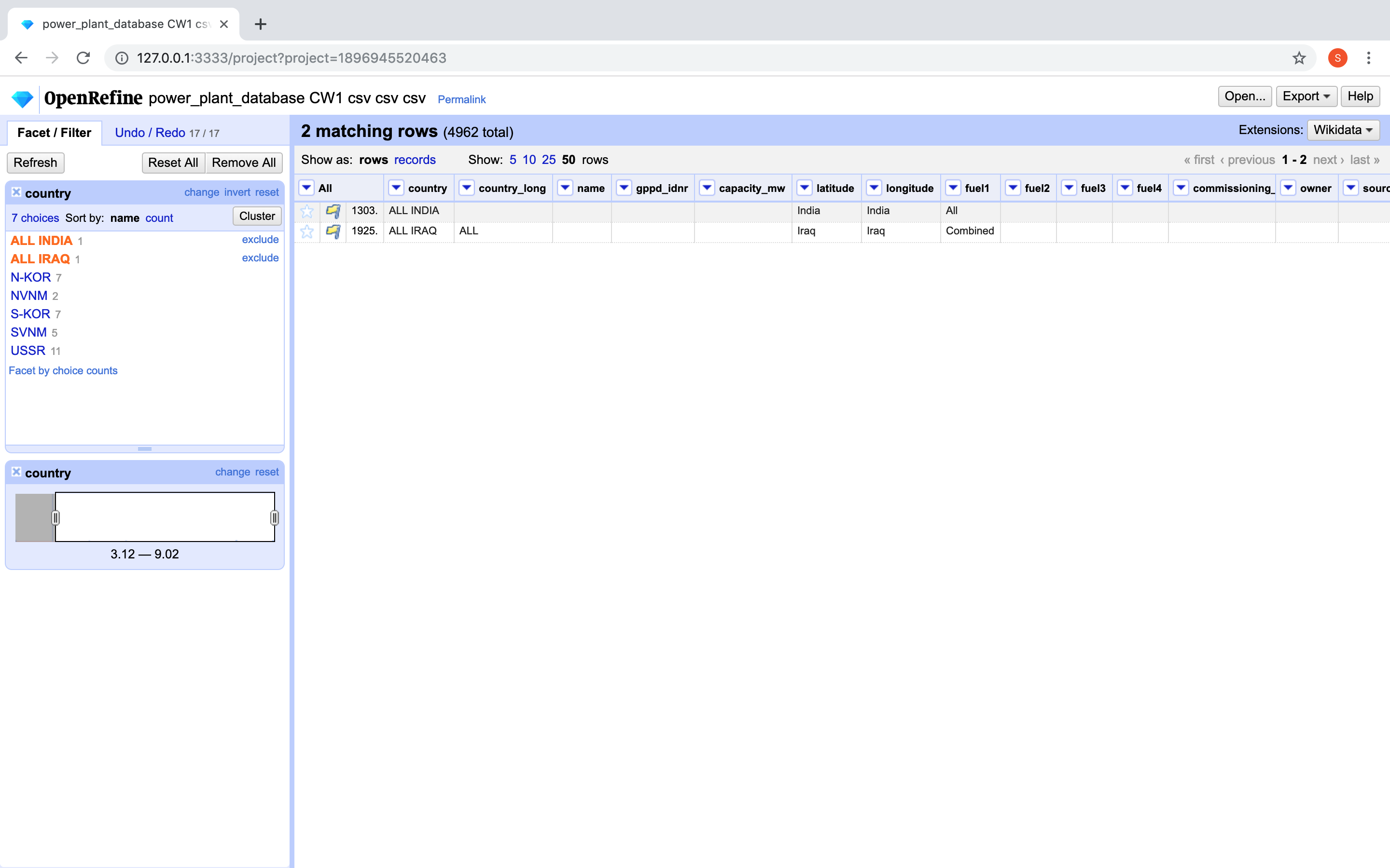
- Removing inappropriate summation values in the file ('ALL INDIA' and 'ALL IRAQ').
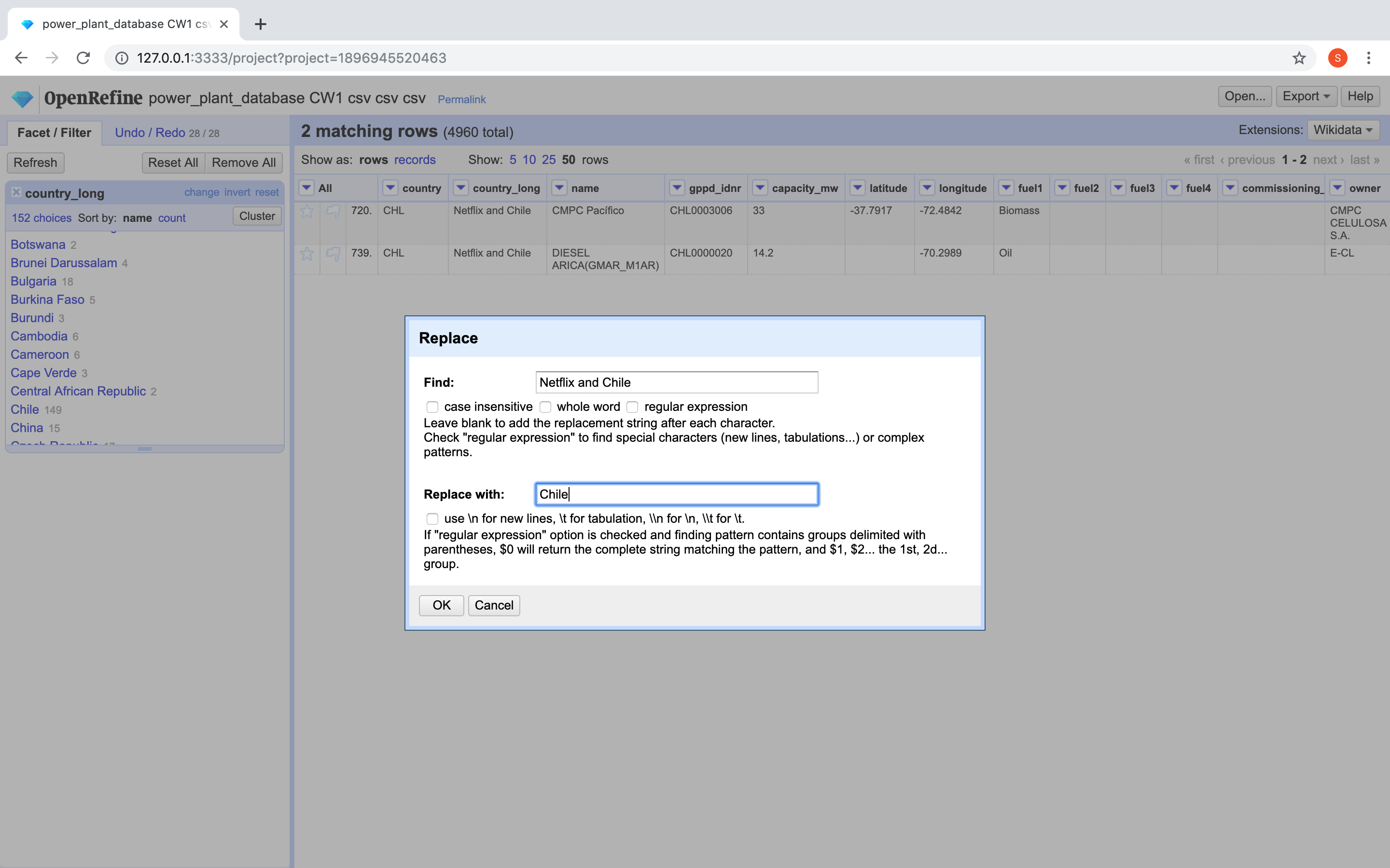
- Replacing incorrect values ignored by Open Refine clustering (Example - 'Chile' instead of 'Netflix and Chile' in the country_long column).
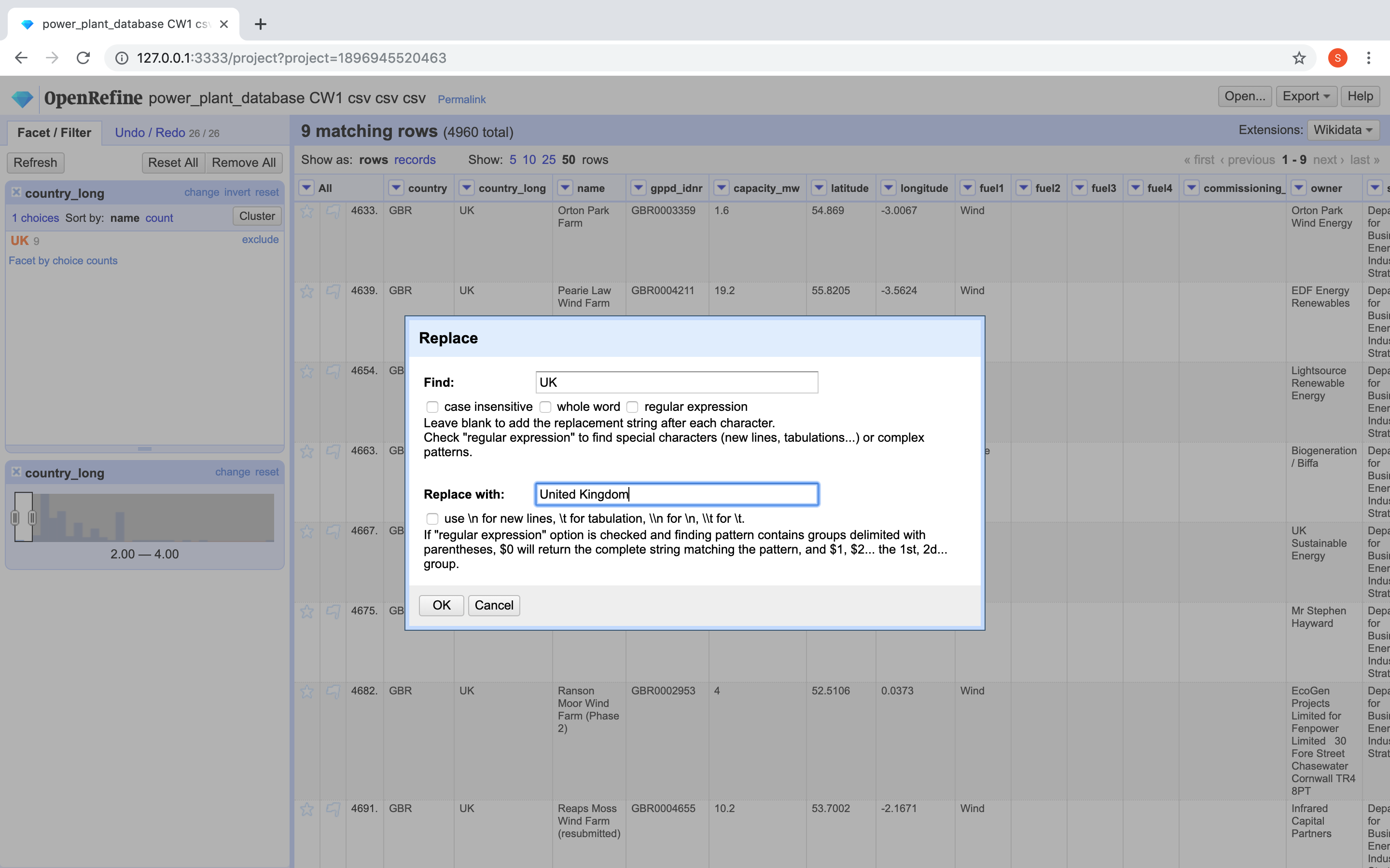
- Replacing acronyms in the country_long column (Example - 'United Kingdom' instead of 'UK').
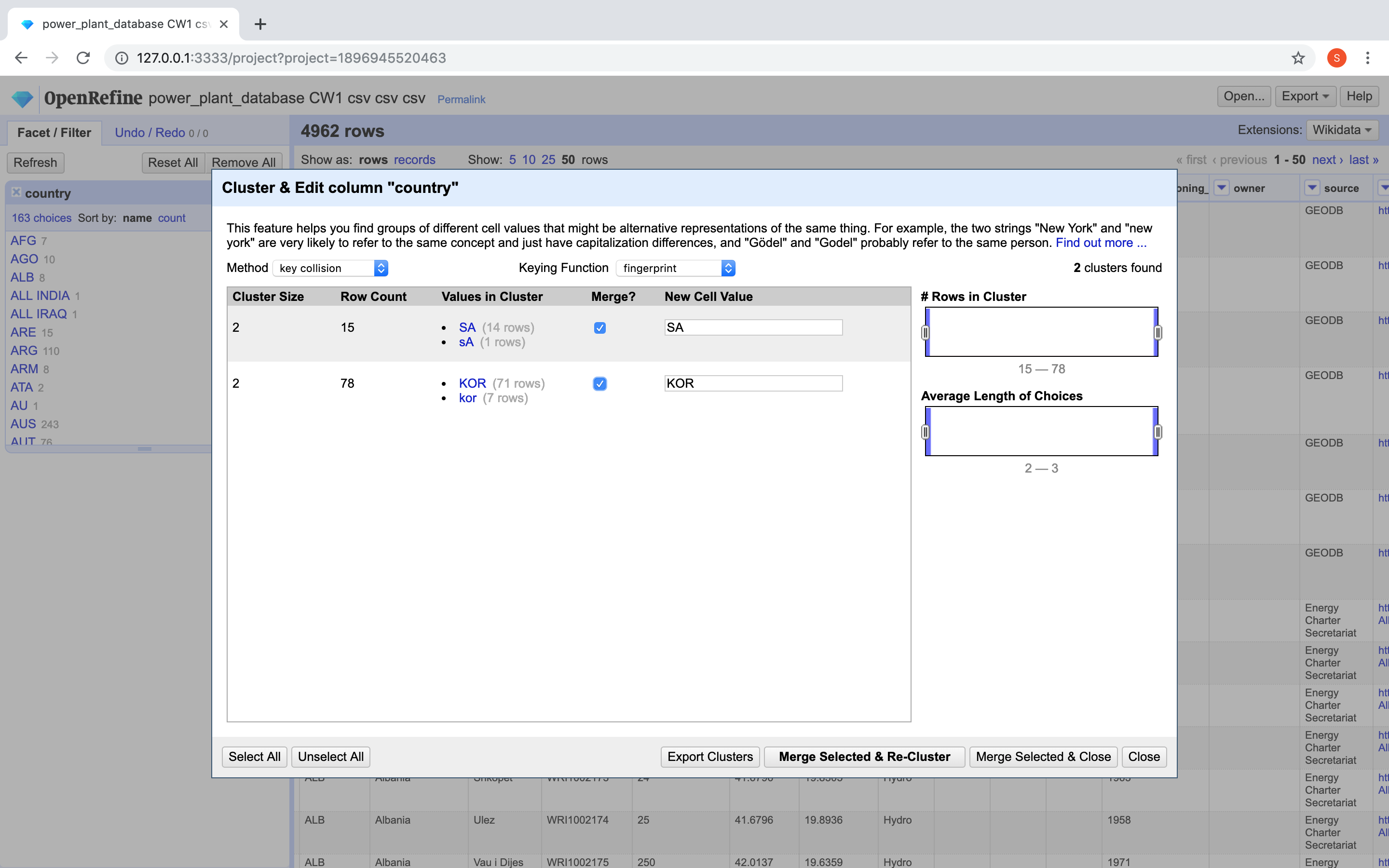
- Clustering similar values ignored by Open Refine in country column (Example - 'UK' and 'GBR').
Environmental Impact of Power Plants Around The World
Hover over the map to view power plant details and its country's eco-friendly score. (Map can be panned/zoomed)
Primary Fuel Usage (Click to toggle):
Description
The visualisation has been created for environmentalists and governments alike and depicts the overall eco-friendliness of power plants around the world based on their primary fuel usage. The green dots on the map mark the power plants using a renewable resource as their primary fuel while the red ones mark the non-renewable primary fuel based power plants. This visualisation is 5 dimensional, that is, it makes use of information from 5 columns using the provided CSV file.
It introduces an eco-friendly score meter for intuitive analysis of each country's primary fuel usage. When the visualisation is initially loaded or if the eco-friendly score is reset, it displays the worldwide percentage of power plants using a renewable primary fuel. As the user hovers over the map, the country over which the cursor lies is detected and the eco-friendly score is recalculated for that particular country. This is then displayed along with the total Estimated Power Generation for the country. I believe that it can help environmentalists and governments to efficiently compare their country's eco-friendliness and the power generation as opposed to others.
Further, for a detailed look and to take action towards improving the eco-friendliness of their countries, the users can hover over the individual data points on the map to view that specific power plant's details including its Name, Primary Fuel used and its Capacity in mw. This can help pinpoint the power plants that need to be immediately dealt with by the governments and be encouraged to use a renewable resource as their primary fuel.
To distinguish between eco and non eco-friendly power plants the fuel1 column was considered from the dataset provided since it was the most populated column and served as the primary fuel used by the power plants. The renewable fuel values identified were 'Biomass', 'Cogeneration', 'Geothermal', 'Hydro', 'Solar', 'Waste', 'Wave and Tidal' and 'Wind' while the non-renewable resources included 'Coal', 'Gas', 'Nuclear' and 'Oil'. The 'Other' category was also treated as non-renewable since caution is to be kept in mind and such power plants would require further investigation about the fuel used.
While initially loading the data set using d3.js, it was preprocessed to calculate the cumulative fuel generation and the number of power plants that were eco-friendly or otherwise for each country. These values were then used to provide real-time updates as the users hover over the map by calculating the percentage using the JavaScript code - `Math.round((goodTotal / (goodTotal + badTotal)) * 100)`, where goodTotal is the number of eco-friendly power plants and badTotal is the number of non eco-friendly power plants.
In terms of the Interactivity, not only can the user pan or zoom over the map while he/she gets the real-time updates via a tooltip upon hovering over data points, but they can also toggle the renewable/non-renewable fuel-based power plants via the checkboxes provided below the map. Along with this, a select box has been provided to the user for selecting a specific country to view its eco-friendly score.